Study design and participants
We conducted this observational study at the Simulation Center of the University Hospital Zurich (Zurich, Switzerland). The study was conducted within a week-long teamwork simulation training in March 2022 for third-year medical students. The target group was chosen as an integrated part of the study curriculum of University Hospital of Zurich’s medical studies program for students to gain practical experience through simulation training. This is a follow-up study as part of the work performed by Weiss et al. [40], where the team explored the potential of mobile eye tracking and multi-person pose estimation to continuously collect data and measure teamwork during simulation-based training in healthcare. This study focuses purely on the debriefing sessions that took place after the simulation training. To elaborate, the study focused on the facilitator-guided post-event debriefing after a medical handover case simulation. Patient handover simulation cases involve healthcare providers practising effective transfer of patient care information. These simulations simulate various handover situations to improve communication skills, teamwork, and decision-making abilities, ultimately leading to better patient outcomes and reduced errors in real-world clinical settings. The inclusion criteria were third-year medical students and participants’ consent. Of the eligible 88 students, 64 actively participated in the simulation scenarios, while the remaining 24 students observed the scenarios and participated in the subsequent 16 debriefings [25, 40].
We conducted this study during the teamwork simulation focused on patient handover. Debriefings followed the “Debriefing with Good Judgment approach” [33, 34]. They were conducted in a circular setting, where two instructors (referred to interchangeably as debriefers in this paper) were positioned opposite the participants, forming a half-circle. All debriefings were led by the same two debriefers who were certified intensive care nurses with simulation-instructor training and more than 7 years of simulation and debriefing experience. Debriefings were conducted in (Swiss)-German, and due to the ongoing COVID-19 epidemic, participants were required to wear masks for safety. We identified the debriefing phases based on the Debriefing with Good Judgment approach (see Table 1). For each recording, we manually marked the start and end times of each stage. Additionally, we manually assigned the respective speaker identities at the beginning. The debriefing session is led by one of the debriefers who takes on the coordination role and initiates the session by starting with the introduction stage. This allows the debriefer to take the lead and provide important context, clarifying their role in guiding the debriefing session.
Study ethics
This study was granted exemption from the ethics committee of Canton Zurich, Switzerland (BASEC number: Req-2020-00200). No patients were involved, study participation was voluntary, and participants’ written informed consent was obtained.
Data collection
The speech was recorded with an off-the-shelf room microphone ZOOM H2n audio recorder (Zoom Corporation, Tokyo, Japan). The audio recorder was positioned at the debriefing circle’s center. Prior to each debriefing session, we turned on the audio recorder to facilitate accurate data collection.
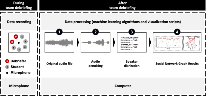
Audio data was recorded using an off-the-shelf audio recorder during debriefing sessions conducted in a circular setting. Machine learning algorithms were applied to de-noise the raw audio data and to identify and track the same speakers across the whole session. The tracked speaker sequence was further manually assigned with respective identity (debriefer/student), which was then utilized to generate interaction pattern graphs, including bar charts and sociograms. The generated pattern graphs visually depict the interactions between speakers in a way that facilitates easy analysis of the respective debriefing sessions
Data processing
We processed the raw data through the use of machine learning algorithms for audio denoising and speaker diarization to analyze who spoke when to whom for how long (see Fig. 1).
Audio denoising
We trimmed the recorded audio files to correspond with the actual duration of the debriefings, ensuring that only relevant dialogue was included (i.e., the respective audio began with the start of the debriefing and ended precisely at the end of the debriefing). Subsequently, we performed denoising of the trimmed audio file using the open-source software FRCRN (Frequency Resolution Convolutional Recurrent Network) [11, 42]. FRCRN is a single-channel noise reduction method developed for enhancing speech in different noise environments to isolate crucial data and eliminate background noise. Audio denoising is the process of reducing unwanted background noise from an audio recording, which both enhances the performance of the speaker diariazation process and facilitates manual data inspection.
Speaker diarization
The goal of speaker diarization is to automatically determine who spoke when to whom. We subjected the denoised audio file to speaker diarization in order to identify individual speakers within the audio segments. We used PyAnnote [5, 29], a software package/library designed to automatically distinguish different speakers as well as their speaking sequence and speech duration. Using PyAnnote, we (a) transformed the voice signal into the frequency spectrum domain to extract distinct voice features, and (b) these voice features were then used to efficiently associate speakers’ identities via clustering algorithms. Utilizing this comprehensive list of data points―who spoke, when they spoke, and for how long―we were then able to automatically generate different visual representations of the debriefing process. To ensure accuracy and reliability, we conducted manual reconciliation checks to check our speaker diarization algorithms. We randomly selected 5 out of 10 recorded debriefing sessions and compared automated and manual speaker attributions.
Data analysis and visualization
The algorithmic toolset of speaker diarization creates a single event tuple for each speech segment (i.e., start time, end time, speaker). This setup allowed for different data analysis approaches: conversation flow bar charts (Fig. 2a), speaking distribution pie charts (Fig. 2b), and sociogram network graphs (Fig. 2c). We further highlight the Summary of Graphs, Objectives, and Usage suggestion in Table 2.
In the first step, we explain the algorithmic toolset. In a second step, we describe its application to two of the 10 debriefings (recording 02 and 05). These debriefings involved the same debriefers (\(D_0\) and \(D_1\)), but different students. The purpose of this selective presentation is twofold: firstly to demonstrate how to read and interpret the output charts and secondly to identify similarities and differences between the two debriefings using the output charts as reference points.
Overview of the algorithmic toolkit output. Conversation flow bar charts a visually depict speaking sequence and timing, highlighting active contributors with debriefers (D) in red and medical students (S) in grey. Speaking distribution pie chart b illustrates the proportional distribution of speaking time between debriefers, students, and silence. Sociogram network graph c analyzes interaction patterns and turn-taking dynamics between instructors and participants, showcasing relationships and communication flows with thicker lines indicating longer durations
Conversation flow bar charts
Conversation flow bar charts visually depict speaking sequence and timing, using bar charts to show the distribution of speaking segments (see Fig. 2a). Figure 2a displays individual speaking time, with debriefers (D) in red and medical students (S) in grey. Bars are arranged in descending order of speaking time, allowing quick identification of active contributors. This visualization highlights the activity level of participants and the sequence of speakers during the session. Our algorithmic toolkit determines the duration of each speaking segment for every person in a conversation by calculating the difference between their start and end times (see Eq. 1). This is performed individually for each person’s speaking segments. Mathematically, the duration of a speaking segment is obtained using the formula:
$$\begin{aligned} \text {Duration of Speaking Segment} = \text {End Time} – \text {Start Time} \end{aligned}$$
(1)
Once the duration of each speaking segment is determined, our code organizes the data by each person. However, it is important to note that the algorithm itself does not know the instructors involved in the simulation. Therefore, manual assignment of the instructors is required to accurately attribute the speaking segments to the respective individuals (see step 4 in Fig. 1). After the manual assignment, the code combines the durations of all the speaking segments for each person to calculate their total speaking time (see Eq. 2). Mathematically, the total speaking time for a person is computed by summing the durations of all their speaking segments, giving us the formula:
$$\begin{aligned} \text {Total Speaking Time} = \sum \text {Duration of Speaking Segments} \end{aligned}$$
(2)
The sorted events are analyzed to identify speaker transitions and generate graph edges. Each edge’s weight parameterizes the thickness and represents the duration of speech between the transitions, calculated by subtracting the start time of the previous event from the start time of the current event.
Speaking distribution pie charts
The speaking distribution pie visualizes the distribution of speaking time between debriefers and students (see Fig. 2b). Debriefers are represented in red, students in grey, and silence in light grey. The chart’s slices depict the proportional speaking time for each speaker or category. Mathematically, the algorithmic toolkit calculated the percentage of speech time for each person by dividing their duration of speaking segments by the total duration of the conversation, including pauses. This is represented by the Eq. 3:
$$\begin{aligned} \text {Percentage of Speaking Time} = \frac{\text {Duration of Speaking Segments}}{\text {Total Duration with Silences}} \times 100 \end{aligned}$$
(3)
Sociogram network graphs
Figure 2c displays the duration of speech segments, with thicker lines indicating longer durations. Sociograms can visualize communication direction using arrows to show flows from students to debriefers, debriefers to students, or students to students. The line connecting two nodes in a sociogram, representing a person speaking to another person, is commonly referred to as an edge. Our algorithmic toolkit automatically constructs a sociogram network graph by adding edges based on changes in speakers during the session. Each edge, denoted as (u, v), represents the transition from speaker u to speaker v. The weight of each edge, denoted as \(w(u, v)\), corresponds to the duration of the speech segment between the speakers connected by the edge. Mathematically, the weight of an edge can be calculated as:
$$\begin{aligned} w(u, v)_ i = \text {{Start Time}}(v) – \text {{Start Time}}(u) \end{aligned}$$
(4)
Equation 4 captures the difference in start times between the current speech segment (speaker v) and the previous speech segment (speaker u). To calculate the total weight (sum of durations) of all the edges in the sociogram network graph, we used the Eq. 5:
$$\begin{aligned} W{(u,v)} = \sum \limits _{i} w(u,v)_i \end{aligned}$$
(5)
where W(u,v) indicates the total interaction time between speaker u and speaker v. It represents the summation of all individual edge weights, denoted as (\(w_i\)), where (i) ranges over all the edges in the graph. By summing up the weights of all the edges, we can obtain the total duration of speech segments captured in the sociogram. By incorporating these equations, the sociogram network graph provides a visual representation of the flow of communication and the relationships between speakers, highlighting the turn-taking dynamics in the session.
The sociogram could be adjusted accordingly to highlight certain information, such as focusing on students’ responses, which would be elaborated in the following sections.
Algorithmic toolkit requirements
Our algorithmic toolkit requires a microphone for speaker diarization and mandates a computer to satisfy the minimum requirements of an operating system compatible with Python 3.6 or higher, a processor speed of 1 GHz or faster, a minimum of 4GB of RAM, and at least 10GB of free storage space, depending on the size of the dataset. Using our proposed system, the output charts can successfully be created within an expedited timeframe of 30 min.


Add Comment